Recently in art Category

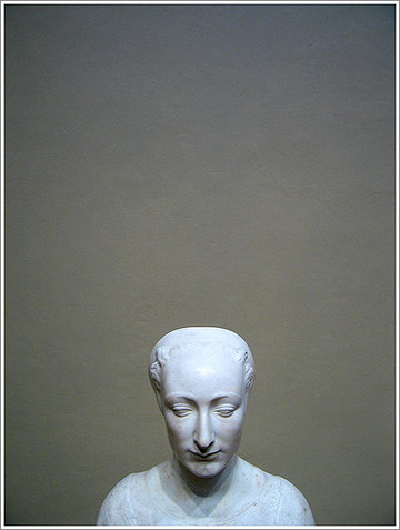

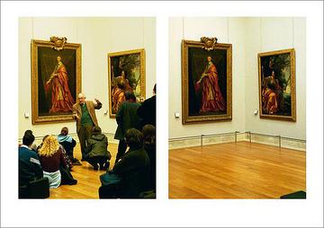
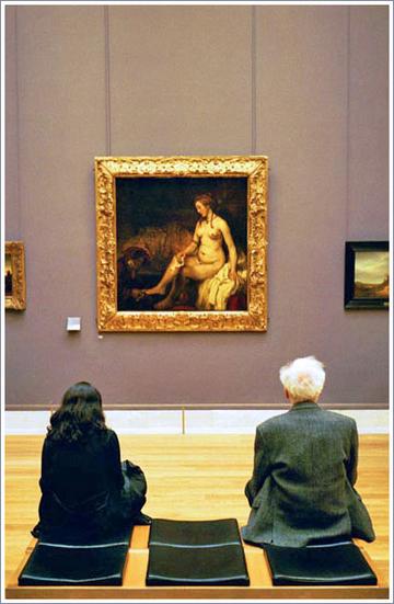
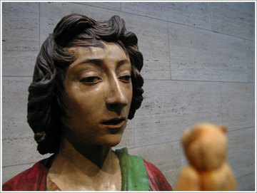
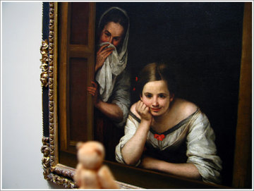
For a split second, the alignment of all elements in front of me created what felt like the perfect opposite image of an Andrew Weyth painting.
At least for me it did. Everything was somehow the exact opposite to "Christina's World". Everything. The setting, the situation, the expectations, the composition, the time, the inside and outside, the colors flipping the perspective... everything. Complete opposites.
So what made me bring the two together?
The shoe of the girl?, maybe the position of her hand?, something about the shape of her hair?... even these elements were barely there... so why did my head make the connection? Why did it rush me to Maine, to Cushing, to the world of Christina Olson? Without aver having been there? (And at that time not even remembering the name of the painting or the artist or the location.)
I wonder if a mars lander would have made the connection by drilling into the floor of the museum. Hmm, maybe I should not have either?
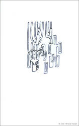
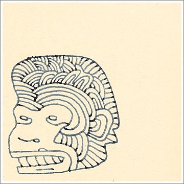
Just came across this guy below in one of the more recent books... The dark spots in the drawing are the ones where the lines end... the light areas are the ones where the lines begin. The final result of a drawing is a piece that looks non-linear, but the process of drawing itself does, of course, have a beginning and an end(ing?)... (the process of looking at the drawing is in itself also ballistic, but who knows how ballistic for such a tiny piece... the drawing is about about 1.25 square inches?...)
there is a point in any drawing when the drawing is not there at all... then there is the dialogue, a game, a set of decisions between the player/draftsperson and the page... then there is a complete little drawing on a page and the game can begin for the viewer/critic/time... it is a bit like playing chess without a board... (let's all hug Marcel Duchamp) or like playing golf without a course (let's hug Chuck Close) and there is not always a clear winner... but there are moves... and each one of the games is a starting point for a completely new and different kind of game... (let's play!)
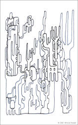
This drawing below consists of 101 moves/strokes/lines/mini-moments/decisions...
Finally managed to cross the park on a weekend again. It was really late, getting dark almost, there was snow, rain, there were heavy, wet jackets, layers. Gloves. Slowly soaked through, finally very wet shoes. It is great when nature takes over in such a man made environment like Manhattan. "Take this, tiny New Yorkers!"
Now imagine the Met on a Sunday evening like this. Packed, soaked masses pretending they to wait for a train, perhaps? Heavy, wet jackets, layers, inspected bags, lines, lines, people, people, screams, calls, amplified whispers... suggested price... real price... second floor... turn left, dodge tourists, sneak a peak at some excellent photography from the collection... turn left again... not too early... left again... enter...
quiet. dark. intimate little gallery... soft voices...
Let's enter: The Dawn of Photography: French Daguerreotypes, 1839�1855 is a selection of 175 images so revolutionary... the ability of some to take the breath away still holds, holds a hundred an fifty years later, in the age when images often do not make ever make it to become real world objects.
What could possibly be so special about often tiny little metallic images, barely visible from some angles, somehow fragile looking and often scratched, strange, almost holographic?...
Dawn of photography. What could one expect here? Portraits of those wealthy enough to have a picture taken, not wealthy enough to have their faces painted? Humans, long gone, turned into strangely still black and silvery metal pieces, their heads supported by their hands or invisible metal braces? Blurry children who did not manage to sit still long enough to actually burn their image in to the metal plates?... Images of Paris? The French countryside?... The colonies.
The first important realization in the exhibition is probably that some of the aspects of the technology on view here appear superior to what we are used to seeing every day. We are now somehow trained to accept a world in which images are turned into data, they are compressed, decompressed, animated, moved quickly across our ever changing liquid cristal screens. Wild colors and sounds somehow distract us from the emptiness often found between "keyframes".
So the very first amazing discovery one must make in the intimate exhibition is just the superior resolution of Daguerreotypes. Yes there are images portraying Paris in something that can be probably best described as no color... yet the images we see are such perfectly detailed reflections of the city, each little window appears so beyond what one might actually even see in real life, that the effect is more of a beyond reality experience. The paris shown here is not some funnily animated movie. It is also not a highly saturated and beautified impression of light, collected on a large canvas... no this is a supreme reflection, a microchip like precision. This 1850's paris looks true to itself.
We realise that all objects on the Daguerreotypes are reversed, as a camera records a mirror image of the subject it is pointed at... today's cameras follow the same principle except that the reversed image they record, the negative is later transfered, often onto a paper surface and usually enlarged. The photographs we usually hold in our hands are objects that were touched by light that passed through a negative made with the help of reflected light that was actually visible at the scene. (I do not even want to think what we are looking at with digital photography... oh and polaroids are a completely different story...)
What makes these Daguerreotypes such powerfully magical objects is the fact that they are the ones that actually were present when whatever we see on them today happened in front of the camera they were mounted in. There is no transfer process, there is no copy. The objects at the Metropolitan Museum of Art right now are time travelers, unique pieces, real witnesses, they are mirrors with the ability to remember one single reflection.
Each and every person portrayed in the Daguerreotypes presented at the Met, did not really look the way we see them in these pieces... but when they looked at these images, they must have been much closer to them than even our own photographs today... all of these pieces are mirror images of the sitters.
We somehow learn to be more familiar with our own mirror image than with photographs of ourselves, don't we?
Combine these two factors, the breathtaking precision and the idea that we are looking at unique, slow-mirrors (as in slow glass) and now you can almost imagine the rooms of the Daguerreotypie exhibition fill with the memories of those reflected here. People, objects, locations... what if they reappeared to face their own reflections... (just a thought.)
And those reflected are not what one would expect.
One small image depicts an open-mouthed man...
His teeth look very used, covered with plaque...
Not far from here, a parent, slightly blurry, next to the bed of his hauntingly sharply exposed passed away child. Right next to it in another post mortem portrait, a sister perhaps, she is even more moved... the dead child in this frame appears even more in focus. (This image is not part of the exhibition but a good illustration of the mood...)
Then there is an image of a painting... a soft beautiful body, the frame of the image is strangely cropped. The painting depicted appears to be painted by Ingres. In the upper portion of the image, a very out of focus recording of a tiny fragment of another Ingres... This one needs a bit of explanation. We learn that the painting who's image has burned itself into the plate here, is a lost one, portraying Ingres' first wife Madeleine... the Daguerreotype was taken long after she was gone. Ingres' second wife, Delphine, who never posed for him nude, urged the artist to destroy the painting... and he did... yet not without asking a Daguerreotypist to record his memory of his first wife on a silver covered copper plate.
The image was apparently discovered, hidden, in a drawer used by Ingres, at the Mus�e Ingres in Montauban, France.
It is truly fascinating to see how a new technology was quickly applied by many very differently thinking minds. Some of the thoughts turned to images might appear somehow dated and part of the 19th century thinking, but many of the metallic images feel like timeless masterpieces. (Or maybe the hand of time just happens to have aligned the current aesthetic perception with the one of the makers of some of the presented daguerreotypes.) Images of designer samples, or a very incredible arrangement of flowers reminded me of contemporary photography (and maybe how some of it would like to achieve the effect of what I was looking at here.) In a room containing some softly pornographic daguerreotypes, happen to be some interesting non related images. (Not that the stereoscopic erotica from the 19th century were not interesting, of course.)
One of the most exciting pieces in the exhibition might be a rather sweet little portrait of a panting dog taken by Louis-Auguste Bisson for his surrogate sister, Rosa Bonheur. Though the image is embedded in a rather cute, dog house shaped frame, the viewer is very much aware that this very sharp image must have been incredibly difficult to record. The animal appears quite perfectly in focus. How did the maker of this daguerreotype manage to keep even the tongue of the seemingly very happy dog so still?... The exposure times for early daguerreotypes were around 15 minutes... and even after subsequent technological improvements, the exposure times were still in the range of a minute... Could Bisson have used some special trick to obtain the desired effect? Maybe the amount of light was somehow increased to a level where a shorter exposure was possible?... Still... (And no, the dog was not a Weimaraner.)
The last room of the exhibition also contained several gems. Images of death masks, or rather plaster copies of heads of several Arfican tribesmen. Images interesting because of the several layers of creation that were at play here...
Images had been recorded of sculptures which had been recorded, after lives... which had not quite been recorded, taken from an environment barely understood...
Floating memories of heads. Detached from their bodies. No sign of anything that could possibly date them... Series... Even series of these must have appeared more compact and easier to store than the plaster heads, than the real heads, than the ideas of the people to whom these heads belonged?
Still, the results shown here were also hauntingly beautiful...
One of the series actually reminded me of the more current Chuck Close work... which happens to be evolving in the same medium... only very different... perhaps?... Well, different, yes...
And when I looked at some of the images, I wondered if Chuck Close was actually reaching back to an old technique, or if the technique of daguerreotype just waited for a little while, to be rediscovered by somebody who would understand that the fast things are not always the more interesting ones.
To be rediscovered by somebody who understands the energy magic... and the ability to not stop time, but to travel through it...
If I was not quite sure why Close would use daguerreotypes for some of his recent work before I saw the exhibition... after seeing it... it was more than a most logical step... in the right direction...
hmm...
Outside, louder voices, an open gallery, light, sounds, voices, brilliant paintings, turn right, turn right, dodge the giftshop, layers, wet jackets, heavy. Soaked masses, packed. The Met on a Sunday evening...
Outside of the museum were New Yorkers, pushed towards the building by rain. It was time to return home, in soaked shoes, gloves, layers, heavy wet jackets, through the melted snow, the lakes of water. It was really late... and yet it was possible to again cross the park...
I am certainly not getting enough sleep these days...
There is a good reason why most of the recent entries had nothing to do with Art Basel Miami Beach. The show was simply a very serious and large event, some of the encounters were ones that will radiate for the months to come, there are so many new names, so many new things, so many new ideas... some quite spectacular, some somehow abysmal, some wonderful, some not so great... it will take a while for me to digest pieces of the experience and then to place them here, over time.
Please do not think that I am withholding information, or trying to release it with news-channel-like addiction to procrastination...
I took pages and pages of notes. I have a pile of cards from galleries. I have a whole bag with material related to the main show as well as the other events that happened at the same time...
If I were writing about nature, or my own drawings, I would not mind placing insults and injuring descriptions here... when writing about things that influence other lives... I would like to be more considerate... especially with those who are just barely coming to the table...
I know this post might sound like a silly excuse... I am just enjoying the fact that I do not have to write for a particular deadline... and I am also waiting for my memory to soften the waves on some of the stranger experiences...
Slower sometimes does make sense...
ahem... if you scroll down... there is actually a bit of a first entry about art basel miami beach... hmm... slooowlyyy...
How could I possibly try to describe even the emotional size of Art Basel Miami Beach? Just the main event, in the convention center of Miami Beach took six hours to walk through. How could anybody possibly go to a gigantic "Art loves Design" party (theme "carnival") afterwards? I could barely move and really barely see anything somehow focused after the main show. Could it be that I am just too old for these things? Or do I actually need to digest what I saw and heard and spoke about? (I really think that I am simply living far above my age... let's hope I am the baby Metusalem in the making.) I heard of people "doing the main show" in 45 minutes... kids... you must be kidding...
To put things short, no, I was not at the absolutely fabulous design district party yesterday and no, I did not even go to the opening of the little opening of "Long Shots", I did not see "Art Nova" and did not get to see "NADA" Art fair (yet). Gosh, I even completely missed the fact that there is an Inka Essenhigh show at the Museum of Contemporary Art here... by now I feel pretty much like I felt when I first arrived in New York... there is just too much to do to actually get to see it all...
But, what I got to see was quite spectacular, I can not really complain at all. The main venue felt like a gigantic river of thoughts and ideas (some really new and some... ahem... polluted back into the waters...) and I felt a bit like a little Salmon boy, on the second return to the bear infested sexy mountain waters. It was good to see some friendly faces, some familiar pieces, some new ones by old friends...hmm.
I hoped that it would take me a good night of sleep to be able to understand my little notes about the highlights of the show and that I would be able to just post a very comprehensive description of the event here, but this is also not going to happen, as too much happened really, some portion of my visual brain is probably swollen now, I was not allowed to take pictures, or maybe I did not even want to... oh... this post is turning into one huge whining act... (Ahem, I just noticed that I can not find my little notebook I carried around with me yesterday, so this here will be a real memory trapeze act.)
First the happy and familiar. Naoya Hatakeyama�s new work is really breathtaking. The Japanese photographer known for his Limeworks and Blasts and Slow Glass series has some new spectacular work on the market. ATMOS is the name of the series and there is going to be a really beautiful book out very soon. (Taka Ishii from Tokyo had a prototype and it is truly an unfolding beauty.) The photographs, which, as the book and the art dealers suggest, should be displayed as diptychs, present a Naoya Hatakeyama view of industrial as well as natural landscapes in France. Never before have I seen photographs of such spectacular clouds, created by machines made by people, turned into stunning work by a man using a machine. I am really looking forward to seeing large portions of the series in a large exhibition context. (They are unfortunately too large to fit a regular New York Apartment.) Single pieces from the series are still very affordable and certainly recommended. Naoya Hatakeyama does not fail to stun. (The new pieces were available from Taka Ishii in Tokyo and the quite excellent L.A. Gallery in Frankfurt for under $7000/photograph.)
Sprinkled around the fair, was new work by Vik Muniz. His new magazine series makes his work appear more and more like something Chuck Close would probably do if he ever used hole punched magazine pieces. This is naturally a good thing. I am maybe not as ecstatic about the new work as I was about some of his previous streams of visual thought, but Muniz is one magician supreme, the new work is as perfectly crafted as any of his so far. We love Vik Muniz.
My favorite piece by Vik hung in the area of Ben�tez Gallery from Madrid and it was not even technically a photograph but a sepia toned photogravure, one based on the cover image of a recent catalogue of a retrospective in Spain... (Since "Seeing is Believing" is sold out everywhere, this might be the new Muniz book to get? I am not sure if it is out in the US yet, but this should not stop some fans.) The earthy piece at Ben�tez carried some of the warmth and soul of the Muniz' we all "fell in love with"... but maybe that's just me. The graphic piece was also under $10000, I did not ask about the pricing structure of the photographs.
What else was happy and familiar? Here and there were little paintings by Takashi Murakami. They were tiny little mushrooms, maybe 12x12cm, on grey little canvasses... smiling happily for $15000-$50000 each. Hmm...
One could have purchased editions of Gerhard Richter family snapshots, with artfully smeared oil paint, covering all faces in the picture for about the same amount... Some people like it when their investment is cute and smiles back at them, some use different criteria.
To be continued... (of course...)
Here some tiny bits of what was is left of a post after i decided to shorten it and to link as little as possible...
It is difficult to not have noticed that there has been some quite radical change in the design surrounding some of the main Adobe applications. MetaDesign (and I guess it happened in the San Francisco Office?) has completely revamped some of the most familiar icons on the desktops of creative professionals around the world.
Gone is the Photoshop Eye, it is now a little parrot feather. Image Ready is now represented by a set of two yellowish and orange feathers. GoLive, is not a hand (of God?) holding a metallic sphere somewhere in space, but a star shaped window into a galaxy, far far away (okay, it is a star). The InDesign butterfly has a more graphic and more dynamic look and...
Venus is dead?
Adobe Illustrator has a new face, and the new face is not a face at all.

It is now a pink flower.
Clearly, Adobe has worked really hard to teach us over the years that there is a connection between "Illustrator" and Botticelli's Venus. Venus has been around since the beginning of Illustrator and up to version 10 one could take a peek at what the original startup screen of this first Post Script editor looked like. (by holding down the option key when selecting "About Illustrator" from the pulldown menue...)
The face of the Illustrator Venus was sent through more and more transformations and makeovers until it arrived at its somehow final transformation, in Illustrator 10. Venus looked a little tired by now, what would be the next transformation that would have to happen to her, in order to show that she is now even more up to date, that it was worth it buying the new version of the software?...
What happened, is the transformation of Venus, the Goddess of love and beauty into her own symbol, a rose. (Except that no rose was used in the icon, only in the outlines of the startup screen.) The flower used in the upper right corner of the startup screen is a yellow five petal shape... I will not write too much about all the symbols here, as we might want to keep at least something "under the rose"... hmm...
This made me smile... It is a bit of an internal joke...
There is a link to this site from WORKBOOKstock this morning. This might be the right time to write at least a tiny bit about the quite incredible cooperation between WORKBOOKstock and me here. Ophelia Chong, the creative director at WORKBOOKstock selected 6 creatives from around the country and gave them completely free hand to convey the message of
find: inspiration
The creatives she selected are: Anne Burdick, Adam Larson of Shrine Design, Justin Fines of Demo�, Superhappybunny, Joshua Davis of PrayStation, and ... me. (Can you imagine how honored I feel to be included in this lineup?)
All of the creatives were given complete freedom in their work. A true dream assignment.
I was given the opportunity to design the print ad campaign for this year.
Look for the next ad in the Design Annual of Communication Arts to see how far we were able to expand the idea of "finding inspiration".
The ads are a translation of inspiring findings into the visual language of photography and drawing. I used photographs from the WORKBOOKstock collection and extended their meaning by adding sometimes quite unexpected drawings. Many of the ads speak about choices. Many focus more specifically on paths into the creative process itself.
The ads are coded messages which can inspire the users to not only decode them, but to also follow a similar thinking process in their work with words and images.
This is how much I am going to write for now... just a quick note, (also in case you arrived here from the WORKBOOKstock site.)
Why is there no outcry for what happened in Scotland today? I wonder if the event will even make it onto American Television... Castle gang snatches Leonardo... Wow... Did somebody order the crime after reading the "Da Vinci Code?" Hmm... Who will be next, Lady with an Ermine out of the Czartoryski collection in Krak�w?
More here.
And a quite bizarre combination of article and advertising here... hmm...
There is a haunting quality in the work of Julia Oschatz, the young German artist from Frankfurt/Main. There is a certain coolness and coldness and cruelty in many of the depicted scenes, even though the visual language of the work could be perceived as sweet and innocent by someone who does not know a dark side of life.
Take a look at the artist's extraordinary site. Julia-Oschatz.de.
I recommend that you start with the paintings and then look at the drawings, the clay-animation the objects and installations.
Just keep clicking, keep clicking. I also really like the references section of the site...
(Entry to be extended...)
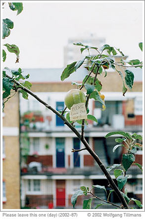
The catalogue to the first Wolfgang Tillmans retrospective at the Tate in London made it here from Cologne. I was lucky enough to get one of the books from the limited edition of 100 containing a charming signed C-Print. 56/100 made it here tonight. The little print is a tiny bit smaller than the book. It is the portrait of an apple, still on a branch. In the background is a large residential complex. There is a little note attached to the apple: "Please leave this one" It is called "Please leave this one (day)" (2002-87), see page 270 . It is almost tempting to keep the packaging that protected the book and the artwork on the way from Europe. The book itself is not very large, 22,5 x 29,5 cm, the box it came in was about 1x2x3feet... The title of the book and the exhibition is: "If one thing matters, everything matters". : )
Here is some information about the exhibition, here some
more information about the exhibition.
The catalogue contains about 2400 images on 310 pages. The soft cover version is still available at the excellent source for photography books: schaden.com.
Additional discovery: One of the packaging layers of the parcel was a poster for the exhibition "Der Fotografierte Mensch" (The Photographed Human) at the Fotografische Sammlung, Museum Folkwang 5/24-7/24 and 8/16-10/5 (?)
The poster is a quite sweet photograph by Nan Goldin "Ulrika, Stockholm 1998"
The piece is especially a keeper because of all the tape marks and folds and cuts which were caused by using it as packaging.
...everything matters.
Boy, am I tired. I am looking forward to sleep and rest and will now just need to head home for just that. I might need to stop for a little bite, but it will be a tiny one, as I do not want to spend the night jumping from drama dream to drama dream. There will probably be music in my head though. Very likely Johann Sebastian Bach's French Suites. In order to make myself stay awake I gave my ears some of that good and wonderful and great. Listened to my tiny Glenn Gould collection on my iTunes. And then I decided to go out there and get more of the humming brilliant goodness. One tiny invigorating piece I must have found in the days of wild scavenges across the folders of friends who knew more about good music than me turned out to be a file called French Suite 5 - 26 - Allemande - gould... The mp3 was a fragment, not even the whole thing. But it was so beautiful. So I decided to quickly get it, and maybe more?... Turns out iTunes store does not have the Gould version of the piece. They have it by Andrei Gavrilov, but, please may he forgive me, his version sounds as if he were driving a monster truck through a muddy field, compared to the crisp and exciting Gould interpretation.
The Gavrilov pieces were also part of some sort of compilation called Double Forte - Bach: Keyboard Concertos & French Suite No.5. (Over here, over here, see the five legged man!) Hmm... this was not what I was looking for.
And then I found "Virgin Veritas - Bach French Suites" played by Davitt Moroney. Hmm, a real bargain so to speak, the whole 52 pieces for the price of an iTunes album ($9.99). This was not Glenn Gould playing, but Davitt Moroney appears to be quite an expert on Bach, oh, and did I mention that he plays hapsicord? (Not one like this, but more one like one of these.
So why not listen to Bach the way he most likely performed the music himself?
... Oh, it is quite an experience... I went from being able to listen to a finely adjusted soft sound of a fragment of a piece played my one of my favorite humans to ever touch a piano, to owning two hours, twenty three minutes and forty one seconds of Bach performed on an instrument that does not do so well when it comes to fine volume adjustments. The music is beautiful, the recording is very charming. (Birds from the garden reply to the music whenever the hapsicord it gives them the sest chance.) But the Bach on a Hapsicord for more than two hours makes me want to go out and scratch some glass for relaxation.
The expression wired is much older than the internet, believe me...
Moroney an Bach are touching nerves in me I never thought existed.
My hands are sweaty, my breath is short, I am sitting so upright in my chair, if i sat more upright I would be standing on my big toes. I am basically bright eyed and definitely bushy tailed, claws out, ready to jump.
My conclusion... I am going to fall in love with this recording... just give me some time and something to squeeze.
How do I link to the iTunes Store?, so you can listen to some snippets at least?
A very nice way of showing off a sketchbook can be seen here. Kevin Cornell did not only do a great job with his July 2002 - February 2003 Sketchbook, he also found an incredible way to present it online. One hundred and two pages presented in a very pretty way, are they not? : )
Enjoy.
David Crawford, an artist whom readers of this blog definitely met, just won an Award of Distinction at the Prix Ars Electronica in Linz for his SMS (Stop Motion Studies). This is fantastic news. Congratulations David!
(This is very well earned!)
(See the other winners here.)
James Paterson was born in London in 1980. His work can be seen on two sites. Griff of ultramicroscopic sent me the link to presstube.com this morning. I then later discovered halfempty.com and the incredible insertsilence.com. I contacted James and hope to find out more about his work process. So far, all I know is from the description of his work on youworkforthem.com I hope they will all forgive me for quoting James here, it is all with good intentions:
"These drawing were done with the help of a piece of software I wrote. The software is a simple arrangement engine that creates static compositions using animation as its source material. I explore the compositions and make selections of anything I find that interests me. Then I make pen drawings based on those selections."
-James Paterson
I like this work. Six individual drawings were available for sale on "youworkforthem", for the fair price of $99. Which ones do you like most? (Available or not.) My favorites are #5 and #9, mainly because of their variety of density within the piece. I am obviously interested in various forms of density in drawings.
I really hope that James keeps on course. I like his animations as well. I am looking forward to seeing more of his work online and offline.
Ladies and Gentlemen, please let me introduce you to a great draftsman of our time Jun-Ichi. Well, actually he is a drafts-boy, because he was born on September 17th 1989. I had no idea this young artist (some call him genius) existed. I was stunned when I found a little book filled with quite amazing drawings. This boy was an art star at the age of 10. He published several books, created visuals for large corporations. He seems to love New York and PEZ.
Enough talk. Let�s look at his really fantastic Scrap Book. Once you are done with it, take a look at the incredible early work. Oh, and then there are several acts of I like drawing. What more can I say. I love the work. I even think he likes my work, because he quite obviously drew me (second drawing, thank you, not the first one, thank you.) When I had sly longer hair. This is an illusion of course. He does not know about me, I bet. Isn�t his work great?
Turbulence.org presents recent work by one of my favorite new media artists. David Crawford�s new Stop Motion Studies - Series 2 (SMS) let us zoom in on microscopic time sequences recorded by the artist in London England between October 12 and October 15, 2002. Crawford seems to do to pictures to pictures what Phillip Glass would do to sound. As the 20 sequences taken in points of human travel through physical and information space expand our perception of time, we can look at subtleties in human expression that would have otherwise only been visible to our still surviving subconscious instincts. Crawford manages to translate non verbal communication into very aware poetic strings of information without the use of words. The camera in the sequences is a quiet observer, part of the hardware of the environment. The �observed� become the software of the short video sequences. All actors are strangers, reacting to being photographed by a stranger. Their reactions repeated over and over by the intelligently edited micro-sequences slowly turn them into familiar acquaintances as we become more and more familiar with their individual body language. The distance between the observer and the observed is slowly reduced through the intensity of observation. By focusing on subtle non verbal expression Crawford reminds us the 90% of human communication which has been �optimized away� by the very media he uses for his work.
Another very intelligent piece by David Crawford.
See also:July 10, 2002
One of my camera lucida ink drawings on shikishi paper is the featured artwork of the week on reFresh : reLoad �, the really excellent interactive Art-Screensaver gallery by Dom Murphy. Several of my pieces are in rotation, but being featured feels really special. In order to view more of the work curated by Dom, download the screensaver, install it, and let it randomly display one of the more than 300 pieces of art, design and illustration by probably about 100 artists. If you like a piece on your screen, one click will bring you to the artist�s site.
If you would like to have your work displayed in this context and reach an audience of about 5000 interested users around the world, follow the very simple submission instructions.
The new gallery season is here. New York, are you ready? Tyler Green posted a very extensive listing of shows to happen this fall in New York. Get ready for a great listing of NYC Galleries, and their Fall 2002 shows. How could one not love New York?
Two tiny little magazines. Just the way I like them.
tiger magazine (Thank you for the link, K) and This is a Magazine (yes indeed.) (Thank you for the link J and M.)
Sweet work. We will contribute.
I saw velvety photographs today. They were exactly what I was hoping to find. I have the feeling that this might be a perfect solution for an idea I had for quite some time now. Something very exciting might be straight ahead. Let�s knock on wood.
When we bought an Alex Katz Black Pond (1989) woodcut from PARKETT last year, we certainly wanted to frame it right. The piece looks incredibly simple and stunningly complex at the same time, it is a woodcut on Goya paper, 11 3/8 x 18 1/8", printed by John C. Erickson, New York. The paper is woven and it is so thin that it appears transparent. The piece is not flashy, it is printed in one color. It is not the most popular piece among the Parkett editions. I think it is still available. So how does one frame a piece so complex and so simple? We needed the help of an expert. One of the editors at Parkett made some recommendations and we decided that the best man for the job might be Yasuo Minagawa. Minagawa Art Lines is a real favorite of many artists. He is a true master of his trade. We are talking master, framing for more than 15 years now. I read somewhere that he uses Maple only and that his finishes are based on secret formulas. His framing style is one that supports the artwork, instead of overpowering it.
I got an appointment eventually and showed up months ago to present him with the Katz piece. I also had a Pottery barn frame with me, just to show a s direction in color and style. (A bit like showing a custom car maker a bicycle in order to explain the function of the wheels.)
The office was not large, but it is packed with (beautifully presented) pieces in various styles. They all seemed like gifts, because of their size and variety. On a chair in the corner was Minagawa�s dog, one of William Wegman�s puppies.
The master was quick and professional. He knew the Alex Katz piece, as he must have framed many of them. He immediately pulled out a wooden corner out of a drawer and explained to me what he is going to do to make it look the way it should. I had a sly different idea however, pulled out the pottery barn frame and explained that I would like some sort of dark wood for the piece. He laughed at me, as if I just challenged him for a wizard match using a plastic ring and told me that he did not use cheap stained wood. He pulled out a darker corner with a quite beautiful texture and offered use it for the piece. I asked about the matting, and I should not have had. There would be no matting on the piece, he decided. I hoped I could argue, but he explained to me the nature of this particular paper, and how it would never work with a mat. (Silly me.) He explained exactly how he would hinge it, so it would float freely and be able to breathe pick up moisture from the air and then to release it without getting out of shape. The piece is alive and it can only be handled in certain ways. I was learning. We were done, I felt that I was supposed to leave.
I did not want to leave, because I had one more little question. I had made an ink version of one of the camera lucida lilies. I actually made it into a drawing that just sly touches a second pane of shikishi paper. A tiny diptych, completely off center. I wanted to know how Minagawa would frame such a piece, so I could maybe give more educated instructions to a framer. I did not really think I could frame the piece with him.
Minagawa seemed to love the drawing. He liked the paper, he liked the flowers, he smiled in a more friendly way for the first time. I was really proud now, announced that I was the draftsman. I asked how he would frame it. He pulled a completely different piece of wood out of a different drawer and explained to me exactly how the piece should be framed. I was amazed. It sounded all like a really good idea. He then gave me an offer that was just perfect, and I decided to have the drawing framed by him. We spoke a bit about the way I came to the drawing. I told the story of the camera lucida, how I got it, how it changed the way I see things sometimes. We spoke about inks and that I should use fast inks. He showed me his color inks which he brought from Japan. He told me of a shop in Tokyo that has the colored inks I might want to use. A few seconds later I knew that it was time for me to leave again. I said good bye to my little drawing that was put on top of the Alex Katz print and next to a huge package that just said A. Warhol. I left happy.
Today was finally the day to pick up the pieces. We had to move several heavy packages that said G. Crewdson on them until we got to two neatly packed brown objects. The framing is stunning. The job is fantastic, I did not expect the pieces to look this great. The frames are much deeper than I had anticipated and so the Katz print and my drawings have their own little rooms behind glass, with just the right amount of space around them. The woodwork looks a little superhuman. It is perfect. I wish I could show what the pieces look like, but I will need to take pictures first. I am very happy.
I had brought my camera lucida this time and we drew some paper cups.
This time I really had to leave, but it felt a tiny bit better than the first time. I went to take a brief look at the Gregory Crewdson show, now with the knowledge that all these perfect frames were by Minagawa Art Lines. I looked at the wrapped two frames under my arm. I could not see the name on the bigger one, because it was covered, but the smaller one had clearly the same writing as on all of the packages in the Art Lines studio. My little package said W. Riedel. I felt a tiny bit more special. It is OK, isn�t it?
INK�TREE editions from K�snacht (in Switzerland) sent me a little catalogue of their upcoming editions. This by itself would probably not be too much of an event, however one of the Artists featured is one of my absolute favorites, the photographer Jean-Luc Mylayne.
Mylayne takes pictures of small wild birds in their habitat. He takes portraits of these birds Birds. Each picture is a well crafted character study. Mylayne knows his subject very well he does not use Telephoto lenses, he befriends the birds. (I am not kidding.) Mylayne travels mainly through France and it often takes him several months to shoot a single picture. He takes great care to study the personality of the birds he chooses to take pictures of. He then wins their trust, befriends them, gets close enough to use his bifocal lens. And shoots pictures from a distance that must be in the range of just a few inches. The Images feel private, the birds have an immense dignity in them, it is amazing work. He has so far shot less than 200 Photographs.
Mylayne apparently spent the last two years taking pictures of The Great Titmouse and of himself, in an Ultimate Mirror Project challenge. The edition offered by ink�tree are four diptychs. Each Diptych shows one panel with a portrait of a Great Titmouse and the second panel with a self portrait of the Artist himself as a reflection in the retina of the bird subject. What extreme closeness of the artist and model. Recorded with Lenses built by Mylayne himself.
The Edition offered are 4x2 Photographs, mounted on 1mm Aluminum 100mmx50cm, in a yellow cloth-bound box, Edition of 12, signed and numbered.
The Price CHF10,000.-/�6,890.-, somewhere around $7000.-
I love the portraits of the birds Scroll down for an example of a sparrow. The Mirror project part of the Diptychs does not intrigue me as much however. I hope there is a way to find a print somewhere that is just a simple print of a bird, no self-portrait of Mylayne included. I hope Barbara Gladstone Gallery has a tiny, simple print available maybe?. I missed my chance to purchase a piece in Parkett, as seen here and even as a QTVR.
Oh, and it is quite difficult to find information about Mylayne, so here is at least a Jean-Luc Mylayne Biography. Thank you.
A refreshingly brief and balanced article on Thomas Struth in the current issue of The New Yorker (Page 118-119).
Almost forgot to post a second impression of the Jerry Phillips show at feature inc. The show has a different hanging now then when I saw it the first time, there seem to be more drawings, the hanging is more dense. The bird drawings did not seem as strong now as I remembered them, but probably only because of the excellence of the surrounding, more abstract works. Some of the drawings seem to be like sly out of focus, over exposed photographs. Wires, grass, objects on the outskirts of daily perception. The exhibition was definitely worth a second visit. (will be worth a third and fourth.) The drawings are quite superb. We saw at least two visitors who did not only look at the drawings, but also looked around, to share their astonishment. A private conversation with great art that packs a real punch. I had the camera with me, yet again chose not to take pictures. The drawings are there, but they seem to disapear when looked at through the lens.
Not sure how many of the drawings are still available for sale. We were considering several, but could not quite decide. yet. (I have the feeling we will have to make that decision quickly. I would not be surprised if most of the pieces were already in bought up by collectors.)
I did not come up with this title. One of the advantages of subscribing to the New York Times is to be a day ahead on the weekend. It is nice to get the big parts of the weekend paper on Saturday, not with the �bulldog� on Sunday. The (tiny) disadvantage is that I can not put a link to an article from the Sunday New York Times, because it is not, well, Sunday.
Manhattan Mecca for Art Lovers is a feature by Roberta Smith about the Chelsea-Meatpacking district area of Manhattan, �the arguably world�s largest gallery neighborhood�. 170 Galleries pretty dense together. New restaurants, new places to refuel other senses too, in an area where Taxis were the ones visiting repair shops just a few years ago.
I am keeping this post very short, because I was on my way out to see one of the shows in exactly this area. We are going to see the current Jerry Phillips show at Feature Inc. on 530 West 25th street.
Have a wonderful day. The weather here is fantastic. I also have the feeling that the weather is quite great in Europe too. (Not as many visitors to this site as on a usual Saturday morning.)
It is supposed to be Damian Loeb's Unofficial Website, but I have the feeling, it is more of a private adventure of his. I was just about to update my link section here on the site and wanted to make sure his site is still up. And what happened?, he added some pretty funny little photo stories. Good fun. Parties, blurry people, a dentist visit, the f to Japan. All shot from the hip. Digitalomography.
Another addition to the site are the square outtake pictures, the smaller, square detail paintings of his more cinematic work. Take a look.
As much as I am not really crazy about his early work, his current stuff is really enjoyable and reminds us that Painting can be quite similar to shooting little movies, and that people used to go �see paintings� long before there were moving pictures or even photography.
I really hope Damian does not move much towards an Eric Fischl style in some of his paintings... (There is the hotel room, and the new small paintings have some sort of layer of rush in them...) Loeb and Fischl are represented by the same Gallery, but I really like Damian�s recent cinematic work much more, and he might be the better painter, if you dare to look at the stuff up close. (Will I be killed for that statement?, is this the end, before it even begun?)...
So let us hope that Damian will keep up his concentration and work hard on better and better paintings... And I am also looking forward to new photos... But that�s a different story...
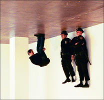
Almost forgot to mention that the South Gallery of Marion Goodman hosts a really great show by Maurizio Cattelan. His work tends to have a great sense of humor. And this time too. It will hopefully make you smile. They are two Police officers. Department of housing. I should have pictures of the installation up soon. (Film is not developed yet.)
We will now leave the house and have some dinner. Most of you are either out to enjoy �datenight� or to see Spiderman?... More about both soon.
Somebody will probably really hate me for this, but the Struth show, well... Struth is an excellent photographer. Maybe his not quite as excellent of a director?, or maybe he should change casting agents? The five photographs, which make the current show at the Marian Goodman Gallery in 57th street, have this subtle feeling of discomfort about them. It was a bit like watching a movie and then one of the actors looks straight into the camera, a move not intended, and suddenly the magic is gone, there are zippers on the backs of monsters, the movie is a movie and not a magical world. The previously published Museum Photographs had a somehow magical feeling to them. The places were the long lived environments, the visitors were just visitors, and after generations the places will remain the same while new humans will move in same ways in front of some of the works of art. Struth�s intention to slow down, not to freeze time seems much better accomplished in his previous work. There is also a certain density fluctuation in the previously published photographs. People tend to crowd around certain pieces they know from books or from the catalogue, they tend to ignore great pieces of art that hang next to those with better reviews. The visitors in Struth�s Pergamon photographs seem like gas molecules, evenly distributed in rooms, because there was space and because they look nice as a composition. Some moving, some standing still, frozen in unusual interactions. (In Pergamon Museum I a visitor is shown a piece of sculpture by a restaurateur. They both look like a diorama from Madame Tussauds, taking on the role of a black hole in the viewer�s attention.) In the Pergamon Museum Photographs there are no real Pergamon visitors, there are actors, characters, types, a mixture of appropriateness. The museum turns into a backdrop, the proportions of importance flip. There seems to be some secret relationship between the photographer and his extras, not a love story between the photographer and the Architecture, or the , or time. I did not go into the show with the intention to be distracted by the actors, but I could not fight my perception of the photographs. I was not looking at the Pergamon, I was not even looking at Struth�s work anymore, I was engaged in finding characters from one image in the others. There is this young guy in blue and green puma sneakers who reappears in three out of the five images in the show. He is grouped with in different �interactions� every single time, plays a sly different role, but he is obviously the same guy, the same clothing. He points to something in the lower right corner of Pergamon Museum I (Which is, btw glued together from two pieces of paper, cutting some of the faces in half) and he is in the lower right corner looking towards the door in Pergamon Museum III. He sits on the bench in Pergamon Museum IV. I know this sounds petty, but there are at least three more people that were employed in various roles in various pictures, never changing clothes, making them quite distinguishable and distracting. I also know that these pictures will probably never hang together in one room again. They will find their way into museum collections and the private rooms of sophisticated collectors, one at a time. They look like what they probably even are, great art. They are quite excellent photographs, there is an almost natural amount of movement in most of them. They just have this uncomfortable aura of sly insecure dialogue in an otherwise perfect setting. Maybe if everything were off. Maybe if the titles were �the guy with blue-green sneakers I�, I would find it quite excellent. Or how about the idea to have new configurations of pictures, named differently. I guess this is a different concept to follow. Probably not by Struth.
The show is definitely worth a visit. It can be interesting to see how unnatural the configurations of visitors on Struth�s photographs seem at first, and how closely they resemble the natural movement of visitors in the gallery itself. Maybe the pictures are quite ingenious. Yes, they probably are. I am just seeing things again. I should just look and be amazed. I really tried. I tried. I will probably need to try again.
It is after one already?, still have not made it out of the house. Will go to see Struth at Marian Goodman Gallery now. Any minute now.
It might be one of those nicer discoveries you can make today. Johannes H�ppi has a new website. You can take a glimpse at some of his paintings of lovers, motorcyclists and waitresses. I think he is preparing an exhibition in New York, I am not quite certain though. I know that there is a new series of painting of �Women and their computers�, which might be what he is going to show here. But I just do not know enough to tell for sure. The site is in German, but it is pretty easy to figure out.
Let�s get ready for another show of grand proportions. Tomorrow�s New York Times will feature an article on the upcoming Exhibition of new Thomas Struth Museum Photographs at the Marian Goodman Gallery on 24 West 57th Street. (4/30-6/15) Looks like this is another show we can look forward to, as the photographs on display will be even a bit more like Paintings again, grand in scale and sharp in focus. The images will be of the Pergamon Museum in Berlin and the human objects in them will be extras, not random visitors, a first for Thomas Struth, making this Exhibition an important transition for him from observer, to creator of a constructed reality. His influence on the image will be the one of a director, not the one of a painter, but the reality is not just the pure observed given anymore. It is created for the sole purpose of art making. Less Cartier-Bresson with a huge camera, now more a Gursky, a Wall, a Muniz or a Lauck. A slow move and a very controlled one. The show will certainly be a success, no matter how success is measured. The Gallery is a high profile place located on the most expensive street in the world, Struth is a high quality artist, taught by the Bechers, and before by the �ber-Master, Gerhard Richter himself. Struth is now friends with the Richter/Moritz family and took some pictures of them as recently noted. Saying more would be too much. I can not even offer the link to the article which will come out tomorrow. (The Times actually wanted to charge me for the link you might have just clicked on, so I am putting the Struth picture in cold storage on my drive, just to make sure I can �fair-use� it once any link comes with a price tag attached.)
A great, pleasant surprise, as I read Five Things this morning. My attention was paritculary drawn to "2". Thank you! Thank you, Thank you.
Glenn Murcutt, an Australian Architect who specializes in the design of environmentally sensitive houses (those that work with nature, rather than against it), won the Pritzker Prize today. This prize carries a $100,000 grant, but more than that is the most prestigious award for architects. It feels good to see that Murcutt won this year. He works alone, keeps animals, uses simple, non luxurious materials and builds projects of human scale. There is a three year waiting list for his work, which is mainly for private residences.
Murcutt finds himself among famous architects (Philip Johnson was the first Laureate of the Pritzker Prize) even though his goal never seemed to be fame (How unArchitectual of him). Good for him. He is also the first Australian to win this prize. Read more in the Article by Herbert Muschamp of the New York Times.
One more interesting detail (from the article): It has been 11 years since an American received the Pritzker Prize. Muschkamp also does not forget to name the Pritzker Jurors, so I will also honor them here: J. Carter Brown, Louise Huxtable, Carlos Jimenez, Jorge Silvetti and Lord Rothschild.
I have tears in my eyes as I am listening to Henryk G�recki�s Symphony No.3. Maybe because I did not expect the vocals to be in Polish? Maybe because this music reminds me of Poland, or at least the Poland as I remember it. Maybe because the Symphony was created just a few miles away from the place where I was born. I have the feeling that I remember the last three months of 1976 in Katowice. Very powerful music, incredibly cinematic, at least for me... obviously.
John Pompa just sent me a link to his new site, filled with beautiful pictures shot mostly against the sky. He even posted one especially for this site! W. (Thank you John!) John is in Berlin right now, so many of the pictures are obviously shot in there. Great sense of style. Great sense of humor. Way to go John! Not even the sky is the limit.
Bootleg Art. funny crazy stuff...Eric Doeringer's Bootlegs. Not a really new concept, but obviously a crazy guy. He makes bongs too. Hmm, does not quite surprise me.
Waferbaby finally posted J�rgen�s Eye in the Eye project!
New Diptych in Diptychs. It is called "Pillow"... for now.
ArtKrush - a website about art� Incredible! Artkrush finds "Powers of 10" Newsworthy. (See News Section, March 20th) There could not be a better welcome. Just walked in. I am absolutely amazed. A good thing is that the last few days have been pretty busy. If all goes well and some of the pictures came out, I might have more material to post. Oh, this is excellent news. Thank you, thank you, thank you.
Monique sent me a great link today. (Thank you Monique) 1000 Journals. I will try to get one. or two, or maybe more?... Ok, not really get, just help to transform.
: )

