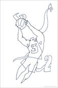
Not quite sure how the basketball-player made it into the book. He is one of my favorites now, especially because he is followed by this floating baby image. The effect is not very apparent here, but when the pages are in a book, the baby is in a spot that the basketball player almost seems to reach for.
I like a generous use white space in some drawings. Leaving a drawing almost bare, almost completely empty helps to focus so much better on what is there on the page.
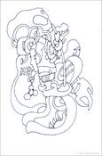
It is often an issue when working with commercial clients that they would either like to put a large amount of information on a page or that they would like to have several equally important elements, messages on the same page.
I think the second drawing shows that it is often more effective to have one soft voice give a tiny message in a bare space, than having ten equally important voices in this same space.
It is of course a grand luxury of free work to have items that contain a message so well coded that it is not directly translatable into any sort of call to action immediately. The drawings here have layers and layers of meaning, but they are not clear selling points. Instead of offering drawings that seemingly contain a very clear message which has the tendency to age and burn out easily, the images today and for the last several days are coded and layered in ways that allow them to travel through time and to release their meaning over time.
who is that old woman walking with a stick in the third one...?
Posted by: on March 17, 2003 08:26 PMquite possibly, yes.
are these lines?, yes.
are these fields?, yes.
are there layers of information?, yes.
: )
oo...so you like to play with words...
hmm...


